Spring 2021 Project 3 Requirements Summary

On this page I highlight what I have fixed prior to this project for projects 1 and 2 as well as going over what I have added for this final project. I also talk about my use of CSS boexes as well as the new layout I have implemented onto this page.


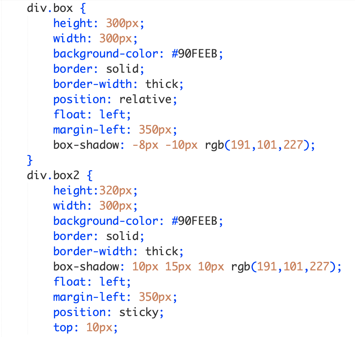
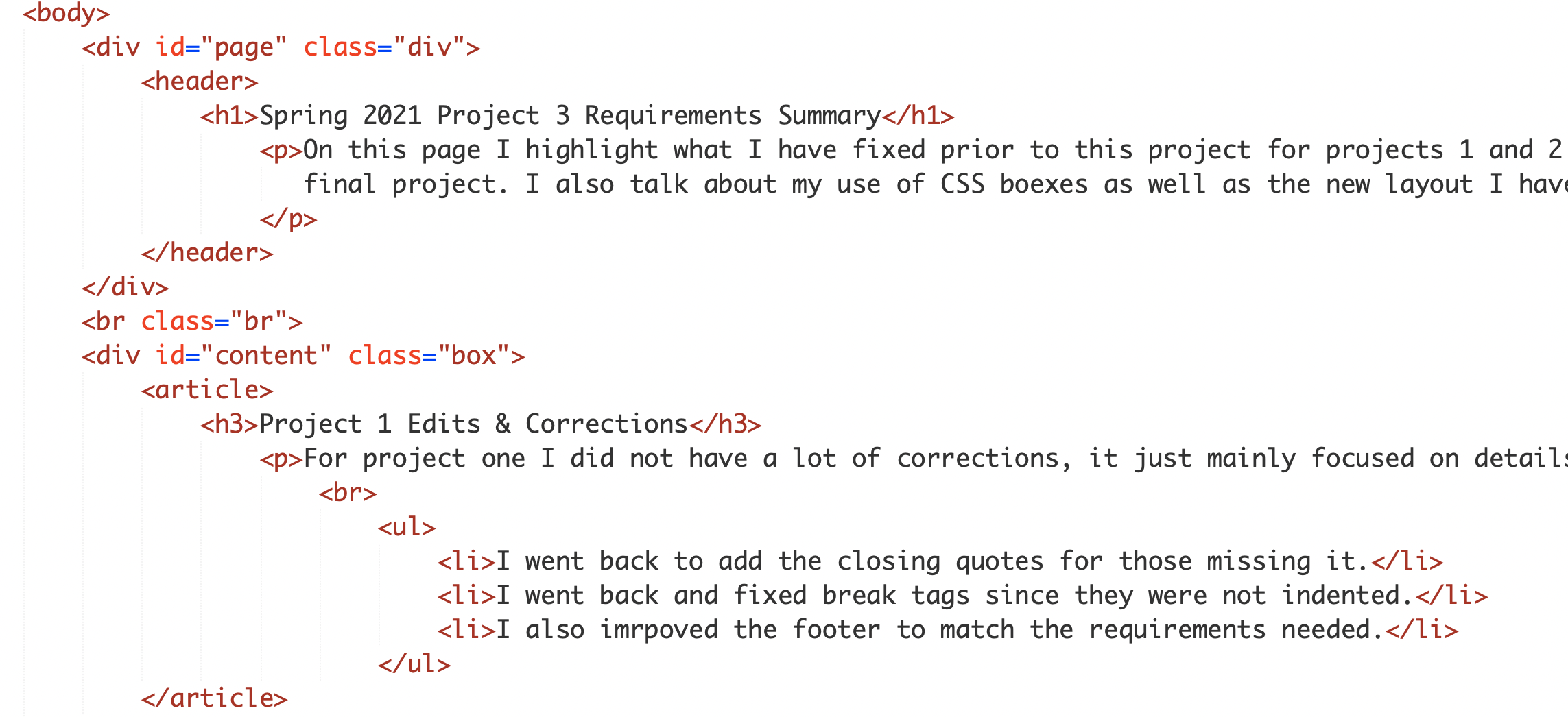
Project 1 Edits & Corrections

For project one I did not have a lot of corrections, it just mainly focused on details.


Additional Edits & Enhancements


Project 2 Edits & Corrections

Again, this project I had a couple of more edits or corrections. I also did forget to include an element that we needed.


Screen & Size Styling Applied

I added in screen and size styling in my external CSS sheet which is applied to my education page. For this I had to use extra resources to master how to use it properly, but when you are decreasing the size of the window that is showing my page it will switch to a light blue background and removes all the style codes. This happens because Media queries can be used to change layout of a page depending on the orientation of the browser. I used the CSS propertie that will only apply when the browser window is wider than its height, a so called "Landscape" orientation. I also added in a max resolution for header 1. A resolution represents the size of a single “dot” in a graphical representation by indicating how many of these dots fit in a CSS. Keeping the dpi at 250 keeps my header the same but if i lower it to 150 it will change to the plain black text a header is in an HTML site.


CSS Boxes

For the CSS boxes on this page I really wanted to focus on two positions for all the boxes. I wanted to include the sticky position because I felt like that would be one used in websites for the future. I also have seen it a lot on websites I visit, I like that the box follows as you scroll, I feel like it is very handy. I have also focused in on the relative position for the boxes so it is positioned relative to its normal position. But I did add in some margin space on certain sides to move them more center. As for styling for the boxes, I added in box shadows because this was something I have never done before and I thought it would be something new and different to add for my page. I also two did different types of box shadows to gain a better understand about how negative pixels would work in coding. I implempted my boxes inside the HTML5 layout which was tricky at first but using extra notes and resources we were given for the class made it very easy to figure everything out. (All screen captures are shown below!)


image of boxes position in code

This screenshot shows how I did the styling for my boxes, although ony two styles are shown those are the only two I used for all the boxes to keep
the same look consistent on my pages. Having multiple options for a position is nice because you can try everything until you find the one you want
and using it with the new layout of HTML5 made it a little tricky compared to labs we completed this semester, overall I feel like the boxes look
very nice with the styles and positioning and help stick to the color theme of my pages.


image of boxes position in code image of boxes position in code

These screen shots show the coding for the HTML5 layout I used in this page. I reallyt like this layout and the new tags because it keeps everything more
organized and it allows new styles to try on pages. Along with this the screen shot shows how I followed the templete we were provided in our textboox
and it shows all the new tags that follow the layout rules. My favotire part about the new layout is the aside tag because it is something new and something
seen on a lot of websites so once I figured out how that tag works I was very excited to use it in this project!