Spring 2021 Project 3 Requirements Summary
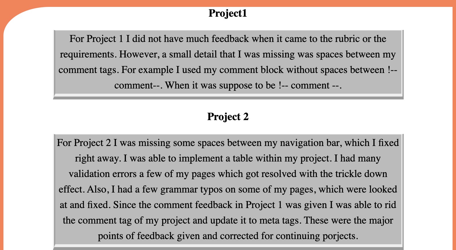
Project1
For Project 1 I did not have much feedback
when it came to the rubric or the requirements. However,
a small detail that I was missing was spaces between my
comment tags. For example I used my comment block without
spaces between !--comment--. When it was suppose to be
!-- comment --.
Project 2
For Project 2 I was missing some spaces between my
navigation bar, which I fixed right away. I was able to
implement a table within my project. I had many validation
errors a few of my pages which got resolved with the trickle
down effect. Also, I had a few grammar typos on some of my
pages, which were looked at and fixed. Since the comment
feedback in Project 1 was given I was able to rid the
comment tag of my project and update it to meta tags.
These were the major points of feedback given and corrected
for continuing porjects.
Enhancements Overall
For this project I continually wanted to
update any styles or layouts that I could. I added
width and height to many pages and even the navigation
bar. I also added a lot of styling to my styl sheet
such as padding, font size, and the clear tag. I had
added a lot of styles prior to starting on Project 3 so
I was able to have an advantage when it came to adding
styles.
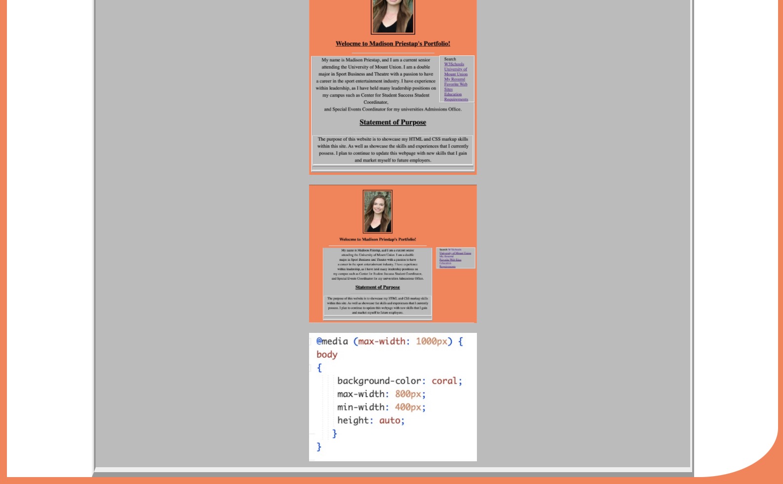
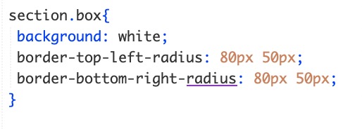
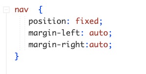
Screen and Style Sizing
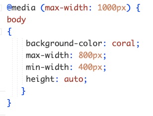
Screen and Styling Sizing is very important to every web user.
The screen tags allow the developer to fit the screen to any
device so the content fits properly and is in an appropriate
layout. This is essentially an accessibility way for everyone
to be able to read the content and have the content fit onto
any device a person may be reading it from.
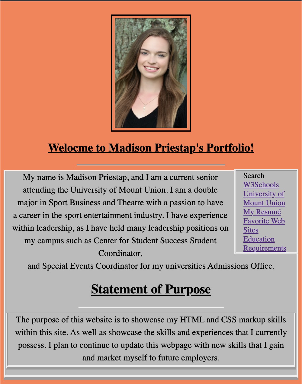
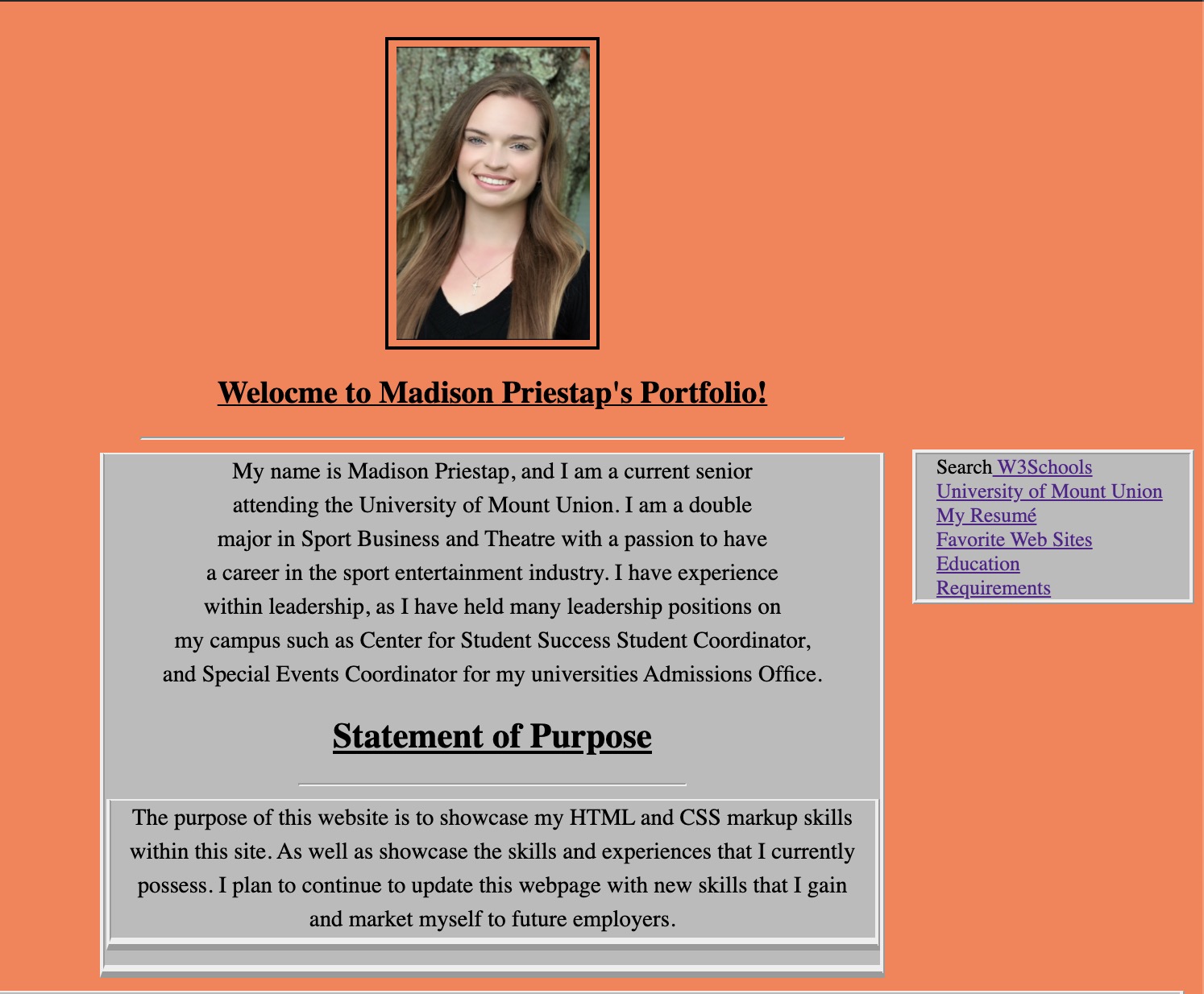
Examples of two different views are prodided below with a code:


Boxes and Styles
For my boxes and styles on my layout page I used variuos styles.
I incorporated width, padding, border styles, background and even radius
touches to some boxes. My CSS designs provide more in depth with what I
did. Examples are down below:


Positioning
Positioning can be very challening but once mastered makes
formatting and positioning conent much easier. There are many that a
developer can use including, fixed, z-index, relative, etc. This can
help a developer put the content where they would like other to be able
to acessibly access the information.

 `Home | Resumé |
Favorites | Education
| Requirements
